Photography Tip Tuesday: Week #3, Portraits
Mar 18, 2008
Hello Week #3 of Photography Tip Tuesdays!
This month we’re examining two snapshot portraits, and why one works, and the other doesn’t. Photography Tip #1 is here, Photography Tip #2 is here.
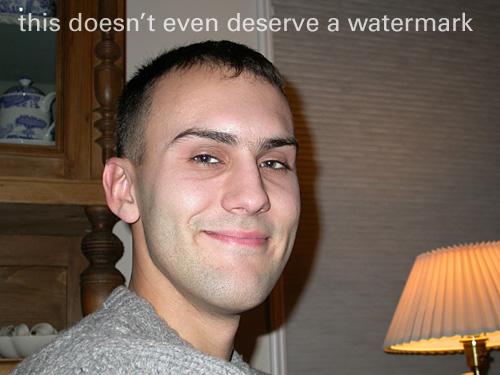
This is our bad photo:
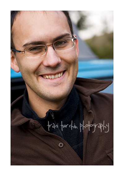
And here is our good photo:
Simple Tip: It’s called “portrait” orientation for a good reason
When you want to print a sheet of paper the hotdog way, you select “portrait.” When you want to print it the hamburger way, you select “landscape.” It’s right there in the name, yet the vast majority of snapshots of people are horizontal prints (probably because it’s easier to hold the camera that way).
A very easy way to improve most of your compositions is to turn the camera, remembering that “portrait orientation is for people, landscape is for landscapes.”
People are tall and skinny, and so they fill the frame better when the photo is vertical. In the bad photo, Nic doesn’t fill the picture. He is the subject, but he’s swimming around with a bunch of clutter. In the good photo, Nic fills the frame.
Stepping it Up: All rules were meant to be broken
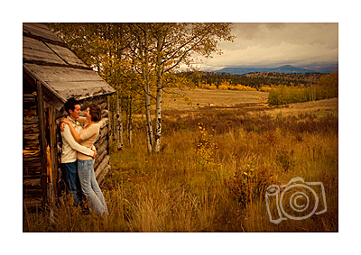
Finding ways to break this rule can lead to very interesting compositions. Most of the time landscape orientation portraits are showing a beautiful landscape, like this engagement portrait:
Close-ups can be very interesting, though, too, because it usually leads to cropping the face in an unexpected way:

If you’re going to use a horizontal orientation, though, it’s important to remember to watch your composition. You most likely will be creating some white space, so you’ll want to make sure that space really is white (and not full of a lamp or china cabinet as in The Bad Photo) and that you utilize the rule of thirds to keep things interesting. (More of the rule of thirds next week for our “simple photography tip.”)
Posted in Photographer Tips
Comments
I love these tips....but I especially love the "this doesn't deserve a watermark" watermark!!! hilarious!